Workozy
Dashboard Redesign
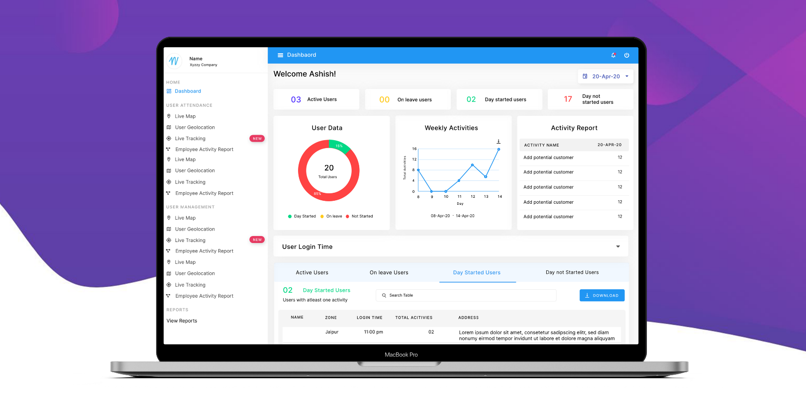
This Case Study was part of my intern at WORKOZY LLP as a UX/UI Designer, the hiring manager asked for a Dashboard redesign.
DURATION: May 20 — July 20
ROLE
I was the sole UX/UI designer on this project, working closely with a dedicated product owner, the business development and a tech team.
💭 The Brief
Workozy started out as a tool to simplify the business cases that hadn’t seen the bright side of technology either because of their unique contexts or the absence of any relevant solution. The existing solutions either were too detailed or too short-sighted for the given business cases. Our mission is to empower businesses and organisation to reap the value of technology during field tasks.
⚡ Challenge
The current Dashboard platform is being used by several enterprises, each with its own department’s structure, staff levels and different process.
- The main challenge was to change the look and feel of the dashboard & hierarchy by changing the user interface to help the company win new customers.
- The second challenge was to improve the experience of Report Creator focusing on the need of the users.
🧩 Process
The process started with an understanding of context, design concept, what a dashboard may look like and in what conditions the user will use a dashboard. To help the client scale their products easily while maintaining consistency across all platforms I also created a design system. The system included a style guide, component library and more.
Let’s first focus to improve the experience of Workflow/Report Creator. I will talk about design systems later on.
A more detailed restructure came into play in the creator section, which proved to be one of the most troublesome for users to create report and workflows.
💡 Context
- The ultimate goal of any dashboard should be to increase productivity.
- Dashboard should be aesthetically appealing and at least eliminate boring factors.
- The dashboard should be promoting the most important insights upon the user’s needs and should be customizable.
✍🏻 Design Concepts
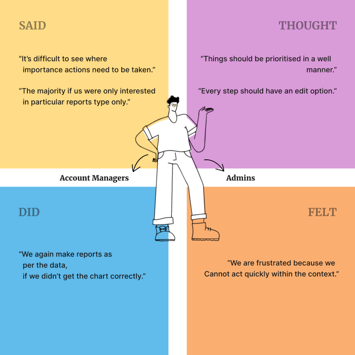
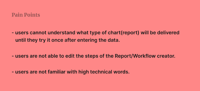
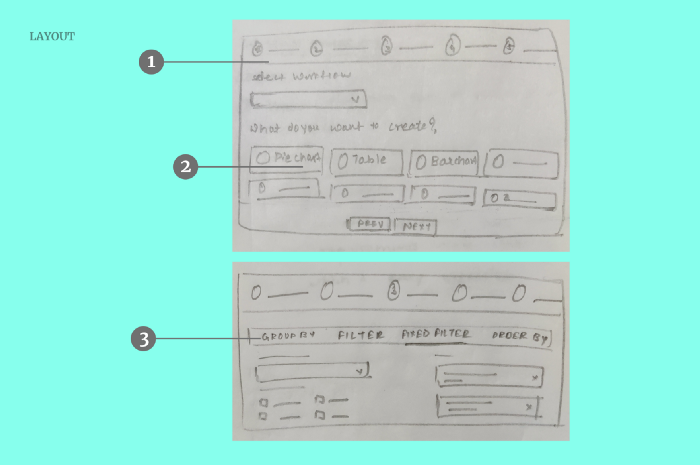
Keeping in mind Empathy Map; users pain points and motivation I came up with sketches shown below.
LAYOUT
- Introduction of a stepper view, which dramatically decluttered the whole interface. user can edit any step any time
- Improved steps and colour-coding created instantly identifiable events, especially for those users on the move who required fast and easy access make reports and workflows daily. card including report type with icon and short information
- One of the steps contains tabs; based on the requirements while creating the report.
🌈 Creating a design system
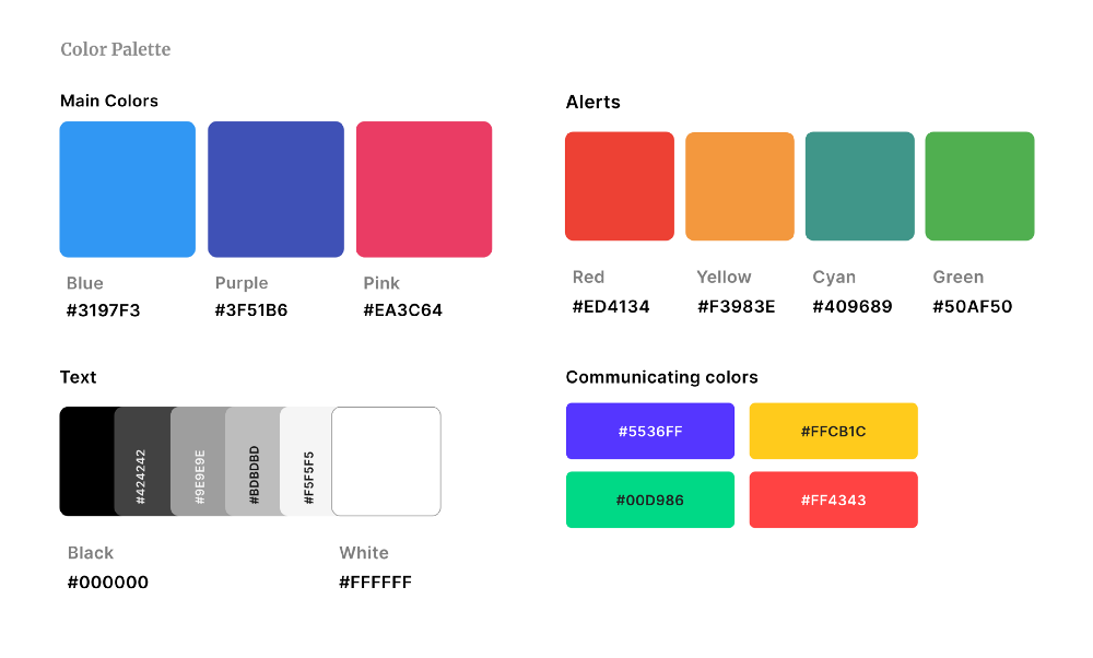
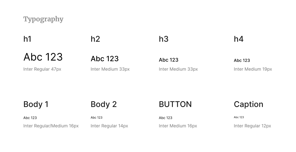
To bring professionalism into charts and numbers, I chose a calm color palette which creates an appealing and clean look. For primary colors, blue and purple were chosen; for additional accents, the pink color was picked. The choice of the background color turned on the light to make the layout airy and easy to scan. Sans-Serif Google fonts — Inter was chosen for better legibility and corporate touch. Material Icons were chosen for dashboard Design System.
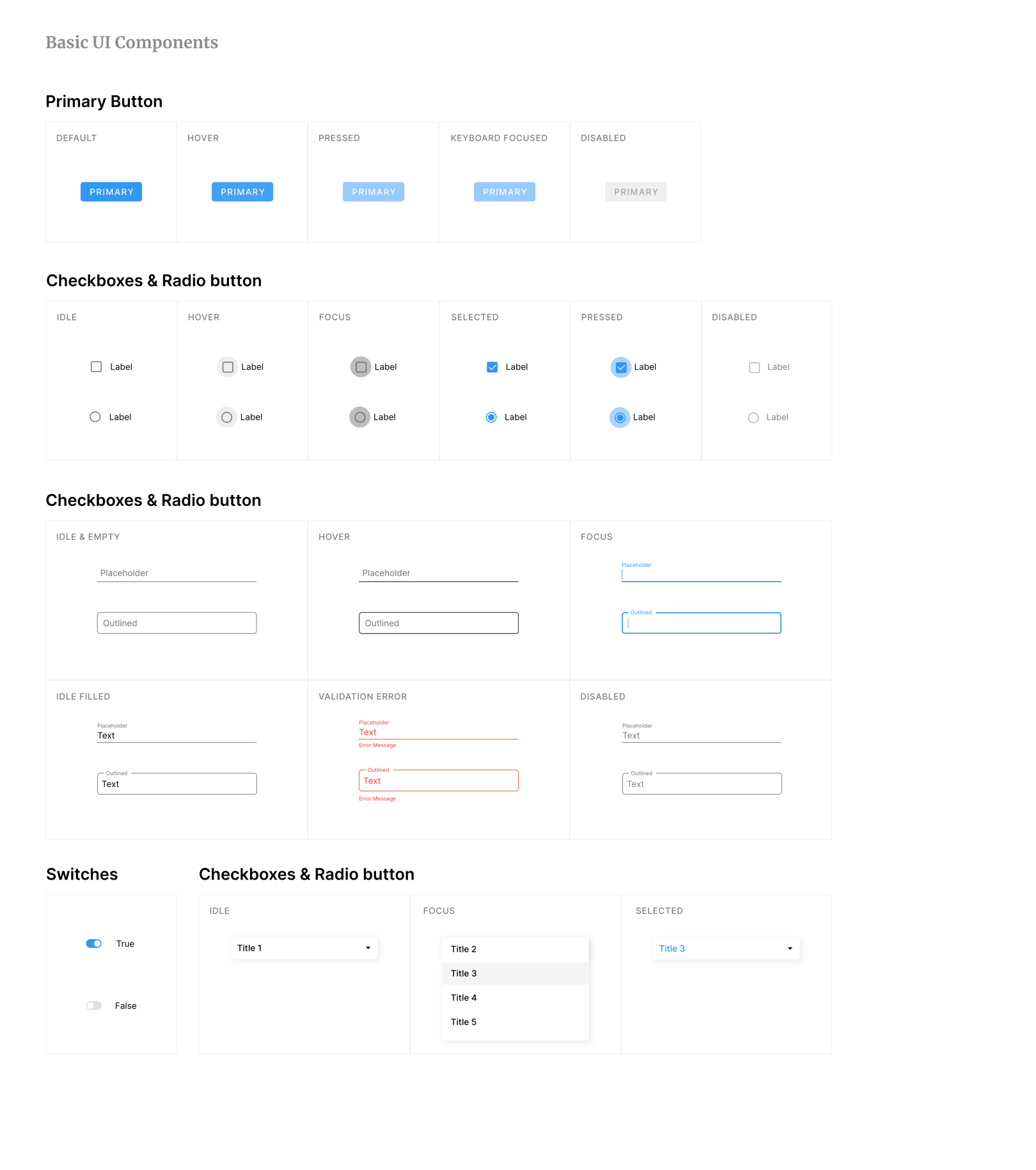
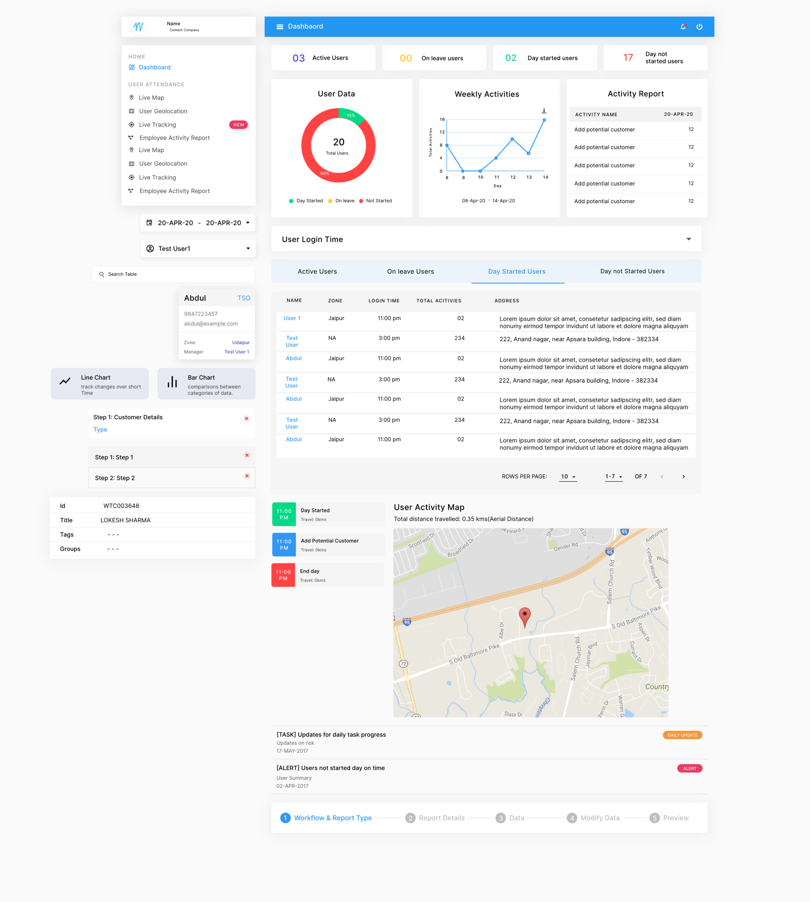
In our distributed team’s weekly meeting we discussed the progress of the MVP, the development of the design system, and specific questions and feedback about its components library working closely with the front-end developer.
🔎 Result
We launched the MVP successfully and the platform is being used successfully by large enterprises. Users were happy after usability testing and were able to use Report/Workflow Creator easily.
🤩 Reflection
What I enjoyed the most is the part where I had to make one of the features more functional and of course Design system. The overall challenge, however, was exciting, and I am happy with the outcome and look for more challenges in this regard.